

8 of the Best Representing Data Resources for Teaching Graphs and Statistics in KS4 Maths
Help your GCSE students extrapolate, interpolate and correlate data using bar graphs, scatter graphs, pie charts and more
- by Teachwire
- Classroom expertise and free resources for teachers
We’ve all heard the quote: ‘There are three kinds of lies: lies, damn lies and statistics’. However, only one of those things is on the GCSE maths curriculum, so we’ll be focusing on the latter.
We’ve picked out some handy resources and revision recaps to help students remember which graphs work well and where.
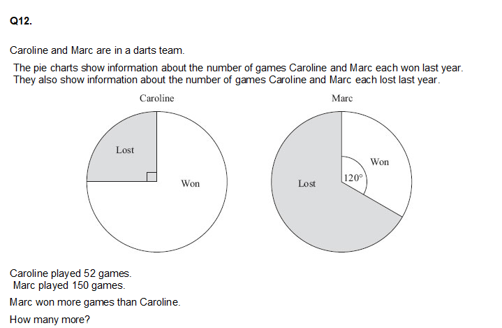
1 | Revision reminder
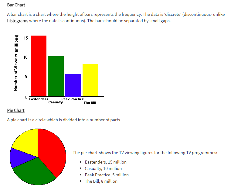
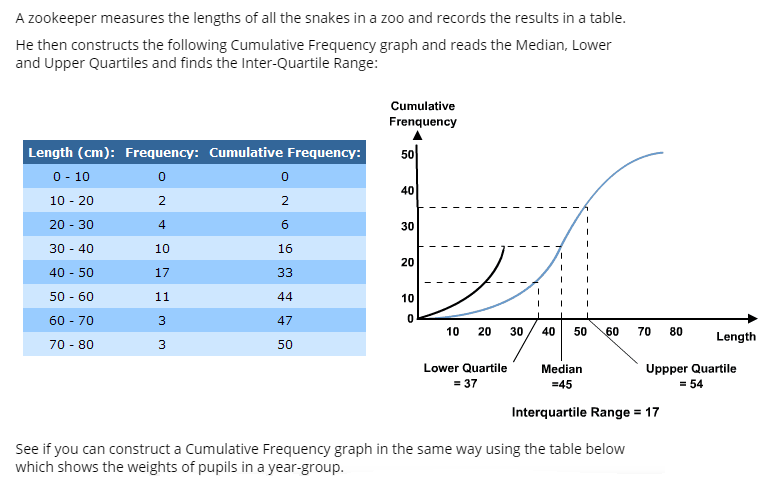
If students need a handy recap to remind them of the various means of representing data this page is a nice and brief guide. It covers scatter graphs, stem and leaf diagrams, bar graphs and pie charts.
2 | In-depth revision overview
For a more in-depth revision guide this one goes through gathering data, before moving on to various graphs and charts.
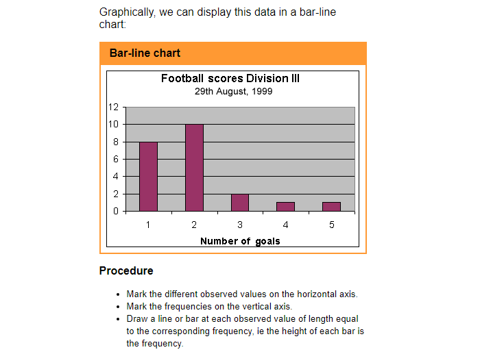
3 | Histograms

If your maths students are struggling to see the point of why we have histograms, this lesson devised by Colin Foster will quickly highlight the limitations of bar charts.
4 | Scatter graphs
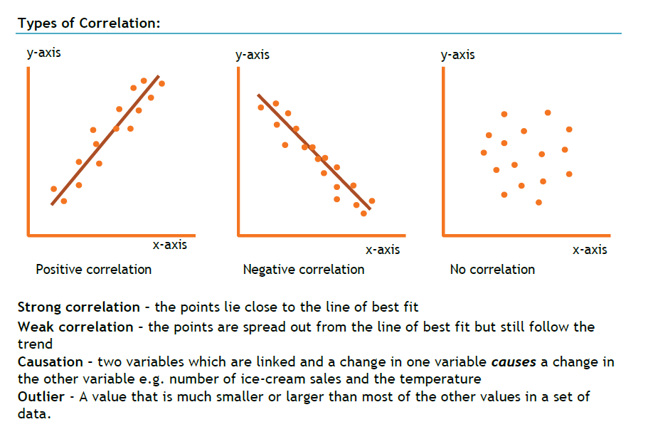
This 14-page PDF from Teachit Maths is a very useful resource for students to practise work on scatter graphs and correlation.
And there’s also a great scatter graph investigation on foot size or this hat-trick of scenarios for students to practice.
5 | Tables and charts worksheets
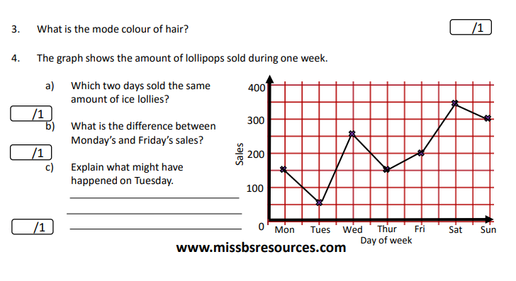
Head on over to the excellent Miss B Resources site where you’ll find this four-page PDF on tables and charts to print and use freely.
6 | Problem solving with data handling test paper
This test paper takes about an hour and 20 minutes to do, or you can edit it down yourself for a shorter version, or just take individual questions to use in your lesson.
Click these links to get the test paper and the answer sheet.
Or find both and other KS4 maths problem solving test papers here.
7 | Presenting data lesson plan
In this interactive lesson on the Guardian Teacher Network students will learn how to summarise information by means of tables and graphs. For each type of data, there is a different type of graph.
By the end of the lesson they should be able to answer informed questions about pie charts and bar charts, understand the construction of pie charts and bar charts, know the salient features of each type of graph, read back information from frequency tables and pie charts, answer informed questions about histograms, frequency polygons and cumulative frequency curves and understand the construction of histograms, frequency polygons and cumulative frequency curves.
Not bad, eh?
8 | Data. Data everywhere
Sticking with the Guardian, if you’re looking for raw data for students to analyse and explore in class then the newspaper’s website has a whole data store of information and raw statistics behind the news, including a wide range of tables and graphs.
Can students find an issue affecting their school or local area that could be turned into a data-handling project?